

Christian Living Communities
Our Vision
Creating communities where aging is honored and celebrated.
Our Mission
Christian Living Communities enriches the quality and dignity of life for older adults through services and care that reflect Christian love, respect, and compassion toward each individual.
Our Vision
Creating communities where aging is honored and celebrated.
Our Mission
Christian Living Communities enriches the quality and dignity of life for older adults through services and care that reflect Christian love, respect, and compassion toward each individual.
![]()
![]()

![]()
![]()
![]()
![]()


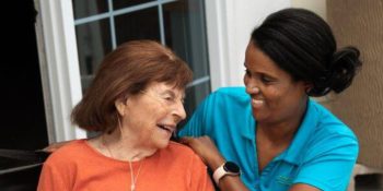
The Non-Profit Difference
CLC is a mission-driven, non-profit organization. We are different than for-profit senior living communities, which are designed to generate profits for shareholders and owners. As a non-profit, we must, of course, ensure sound business practices. But all profits are re-invested back into our communities and the organization to ensure we can continue to meet our mission of enriching the lives of older adults.
A Gift That Grows: Honoring Life, Community, and the Joy of Being Outdoors
This spring, something beautiful is taking root at Someren Glen. It looks …
Nourishing Body and Mind: How Nutrition Improves Resident Wellbeing in Senior Living
It is difficult to overstate the roles that food, nutrition, and the …
Love That Outlives Us: The Enduring Gift of Gil and Jeanette Deters
In 2007, Christian Living Communities received a remarkable act of generosity from …
Advancing CNA Careers through Medication Aide Training
Upcoming Events
Upcoming Events

Make A Difference
Christian Living Communities is the organization it is today because of your generous support.
CLC is able to pursue and sustain our vision, mission and values because of your investment. We invite you to join our community of supporters who are helping to ensure the well-being of current and future generations of older adults in enriching environments of connection, growth, citizenship, and joy.
Hear From Residents
We have been residents at Clermont Park in Denver for four months. Since arriving here we have greeted by everyone with friendliness and enthusiasm. The people who live here are warm and welcoming. I can’t say enough about the staff, from the executive director to the custodians all are accommodating and go out of their way to assist. I love people and have worked and/or volunteered all of my life. I have never seen a group where there is no one who might be called a sour apple. They are, one and all, peaches. On another note. Clermont Park is beautiful and wonderfully maintained. It is a pleasure to be here.Genevieve C Roland
Due to health issues we decided a retirement community was a good idea for us. We have never regretted moving here. The residents are welcoming, friendly and very interesting. There are many activities to become involved in depending upon your interests. It’s a warm, up-lifting, stimulating environment that totally feels like home. It’s also a comfort to us and our family that we will never have to move again. We are definitely at home!Karen Possehl
We have been residents at Clermont Park in Denver for four months. Since arriving here we have greeted by everyone with friendliness and enthusiasm. The people who live here are warm and welcoming. I can’t say enough about the staff, from the executive director to the custodians all are accommodating and go out of their way to assist. I love people and have worked and/or volunteered all of my life. I have never seen a group where there is no one who might be called a sour apple. They are, one and all, peaches. On another note. Clermont Park is beautiful and wonderfully maintained. It is a pleasure to be here.Genevieve C Roland
I made some good friends after moving to Clermont Park. My family loves it. They have also met a lot of good people here.Georgia Bell